What a guest sees when they enter a well-designed wedding website

Skip ahead
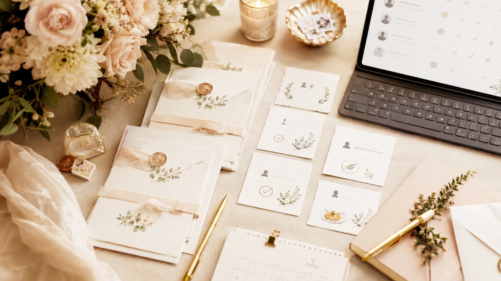
When a guest enters a well-designed wedding website, they are not looking for a spectacular presentation or a long text about the couple's history. Seek immediate guidance. You want to understand in just a few seconds if you are in the right place, when each part of the plan happens, what you need to confirm, and where to check the details without having to write a separate message. That first sensation marks much more than it seems: if the website transmits order, closeness and practical security, guests relax and the couple receives fewer repeated doubts. In Spain, where close family, friends from different cities and various groups with different needs usually mix, a good wedding website acts as a common point of reference. The best sign that it's working is not that everything seems perfect, but that each guest knows what their next step is.
Direct response to organize the first impression
The first screen of the website should answer four questions without forcing you to scroll anxiously: who is getting married, when is it, where is it happening and what does the guest have to do now. If this information appears clean, with a clear hierarchy and a human tone, the experience is already off to a good start. Later you can expand with schedules, transfers, accommodation, dress code or gift list, but the entry should reduce friction, not create it. Many couples make the mistake of treating the home page as a decorative digital invitation. It works better to think of it as a nice welcome that also solves logistics. A satisfied guest is not one who reads a lot, but rather one who quickly understands which part of the content affects them and how to come back later to review changes.
A practical way to achieve this is to build the structure around a wedding website that combines fixed information with clear actions. First the welcome, then the useful summary, then the answers that are most commonly requested by message and, only when it makes sense, links to confirmation, travel, accommodation or gifts. That order makes the experience feel designed for the guest and not just for the aesthetics of the cover.
Practical checklist before publishing the website
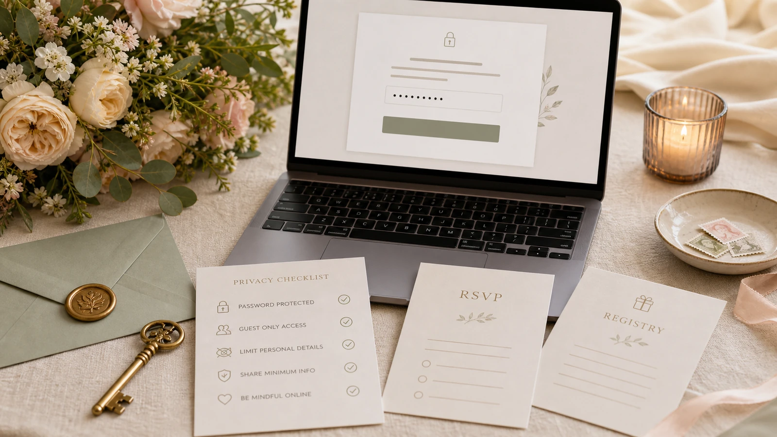
Before sharing the link, it is advisable to do a short review as if you were a guest who opens the page from your mobile while in a taxi, at work or between family group messages. If in that context the main information is still evident, the basis is well resolved. This checklist helps detect the essentials without going into unnecessary technical details:
- The cover makes names, date, city and the next important action clear without forcing you to search too much.
- Hours, addresses and access notes are written in plain language and updated in one place.
- The RSVP has enough context for the guest to know what to respond and by when.
Topics
- Web de boda
- Bodas en España
- Wedding planning
Planning RSVP, registry gifts, and guest details together?
bodaya brings wedding websites, RSVP, guest lists, registry contributions, and thank-you follow-up into one connected planning experience.
Start planning