Wedding Website Examples: What a Beautiful and Useful Site Should Include
Skip ahead
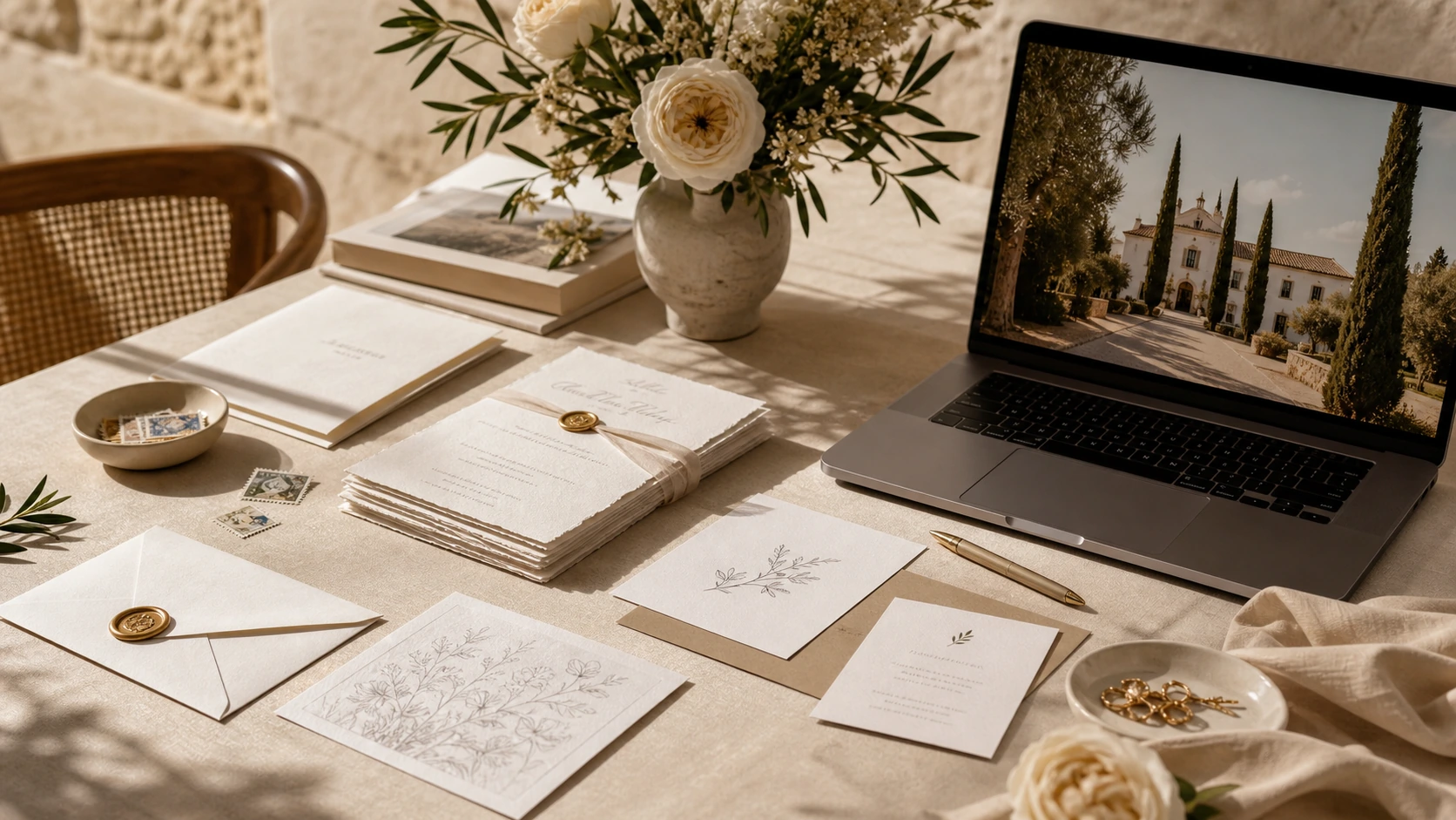
Looking for wedding website examples often starts as an aesthetic decision and ends as an organizational one. A couple sees a beautiful homepage, a polished photo, or elegant typography and thinks, this is what we want for our wedding. But after a few seconds, the key question appears: does it really help guests, or does it only look good in screenshots? For a wedding in Spain, that difference matters because several groups usually need different things at once: family members who want clear timings, friends asking about transport, guests travelling from another city, people who need to confirm menu choices or allergies, and others who simply want the correct information without chasing scattered messages. That is why a strong example is not the one with the most decoration, but the one that shows how a website can keep order, tone, and usefulness in the same experience.
A direct answer for couples who want to get it right
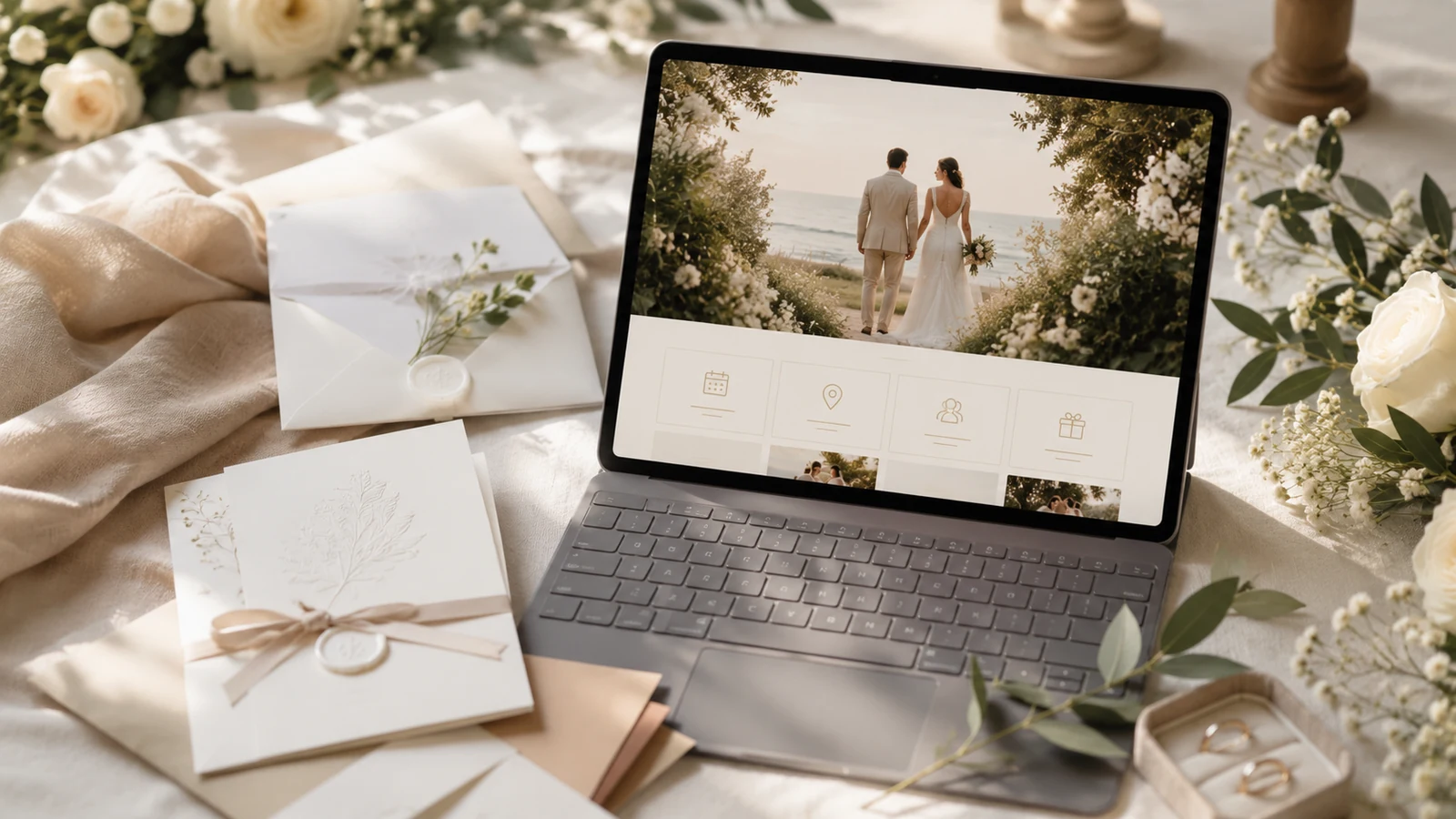
A beautiful and useful wedding website should solve three things from the start: guide, reassure, and move guests toward the right action. Guiding means a guest quickly understands who is getting married, when, where, and which part of the plan affects them. Reassuring means they do not feel key pieces are missing, because they see a clear structure with the schedule, locations, FAQs, and enough context. Moving them toward the right action means confirming attendance, checking a travel detail, or reviewing a practical recommendation does not require reading the whole page. When you compare examples, pay less attention to whether the hero section is spectacular and more to whether the important information appears in the natural order in which people think: first orient themselves, then decide, then explore further. That usually separates websites that only inspire from websites that genuinely help.
One useful way to judge this is to imagine a guest’s first visit and place the essentials inside a wedding website that reads almost like a decision page: a brief welcome, visible date and venue, clear buttons or links, and sections that separate the beautiful from the practical without making them compete.
A practical checklist before you publish
The best examples share one very specific feeling: everything seems easy to find, even when many decisions sit behind it. Before publishing, it helps to review the site through a guest’s eyes, not through the couple’s. That distinction matters. The couple already knows what every block is trying to say; the guest only knows whether the plan is understandable. If you like an example, take it apart: where the date appears, when the RSVP request shows up, whether the map arrives too early or too late, whether accommodation details sit near the schedule, whether the FAQ answers real questions, and whether long text adds calm or fatigue. That practical reading stops you from copying a beautiful layout that later forces you to answer the same question again and again by chat.
Topics
- Web de boda
- Bodas en Espana
- Wedding planning
Planning RSVP, registry gifts, and guest details together?
bodaya brings wedding websites, RSVP, guest lists, registry contributions, and thank-you follow-up into one connected planning experience.
Start planning